The design of the web site is the same as clothes, and there is a fashion and it is obsolete.
I introduced in the previous article in the last, gradient has become a boom, I think to see in various sites.
So today, i'll introduce a good web design of the evaluation that was entered in April from AWWWARDS where refined designs from all over the world gather.
I think that i can know the latest trend, please refer to the site production and the design by all means.
Toggl(Toggle): United Kingdom

Toggl – Free Time Tracking Software
Xavier Cussó: Spain

Digital design & art direction — Barcelona | Xavier Cussó
Conti Ducco: Italy

Geex Arts: Russia

Geex Arts – Creating the Most Impressive Websites
Maison Riviera: Canada

Maison Riviera – Yogurts, Cheese, Butter and Sour Cream
The Shift: Japan

Carl Nielsen Int Competition: Denmark

Carl Nielsen International Competition |
Design Canada Design Canada

Design Documentary — Design Canada
Bram Krekels – Portfolio: Netherlands

Bram Krekels – Creative Front-End Developer
United Athle Look Book SS 2018: Japan

United Athle | SPRING & SUMMER 2018
Thomas May Bespoke Joinery: United Kingdom

Thomas May | The Finest Bespoke
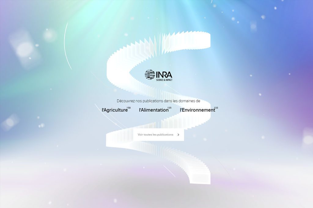
INRA Highlights France

Muffin Group: Poland

Muffin Group | WordPress Theme Developer
Port 32 Fort Lauderdale: USA

Port 32 Fort Lauderdale – A Marina Collection
Summary of web design trends in the world
Of course, there were many sites that use gradients, but I thought throughout that there are many sites that move.
In the past, sites using videos and heavy GIFs in relation to data capacity were reluctant, but most recently, is it due to the fact that the communication speed went up and such a display speed and capacity problem was cleared?
Web site production that moves in Japan, such as GIFMAGAZINE company seems to be becoming popular, and take up somewhere and put such a gimmick at the time of site production and attention to the future trend, You may be able to drive the trend.
The design element which I felt that there were a lot of this time
Part or all of the site moves finely
Design that combines photography and typography


